Press and media kit
The IIR's press and media kit contains useful links as well as our logo and guidelines.
The IIR's press and media kit is managed by our Communications and Marketing Department, and is a dedicated area providing easy access to our logo, contact information and other resources about the IIR in order to facilitate media coverage about the institute, and to use our branding.
For more information please contact communication@iifiir.org
Resources
- IIR logo and guidelines
- IIR Manifesto video
- 2025 Activity Report
- IIR Brochure
- Boilerplate
- Brand identity
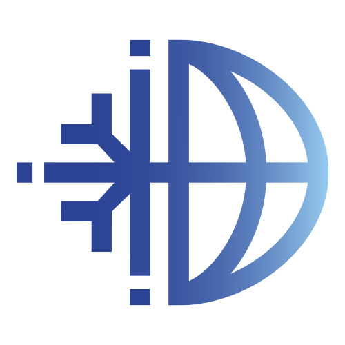
Logo and guidelines
The new logo brings together the defining pillars of the organisation; science, policy and industry symbolised by the dots around the periphery of the logo which are separated from the rest of the logo to highlight the institute’s independency; global reach, expressed through the world motif; and cold, represented by the snowflake. Within the centre of the logo is a vertical equals sign which symbolises the need for all nations to have equal access to not just refrigeration resources but also efficient refrigeration equipment.
For the first time, the IIR introduces distinct English and French versions of the logo, reinforcing clarity across its two official languages, and integrates visual temperature cues to highlight the essential role of heat pumps as core refrigeration technologies.
Please favour usage of the full, colour, version of the logo. If space does not allow, then the version with the icon and acronym only may be used.
Boilerplate
The International Institute of Refrigeration (IIR) is an intergovernmental organisation dedicated to advancing refrigeration and heat pump technologies and their application for a sustainable future. With the world’s most comprehensive knowledge base, peer‑reviewed publications and regular international scientific conferences, the IIR drives the dissemination of cutting‑edge research and fosters global collaboration across the sector. The IIR connects researchers, industry experts and policymakers to support informed decision‑making and turn scientific progress into practical and reliable applications. Founded after the first International Congress of Refrigeration held in 1908, the IIR is a global reference, providing trusted knowledge and data to support the deployment of sustainable, efficient refrigeration technologies essential to food security, healthcare and climate action.
Brand identity
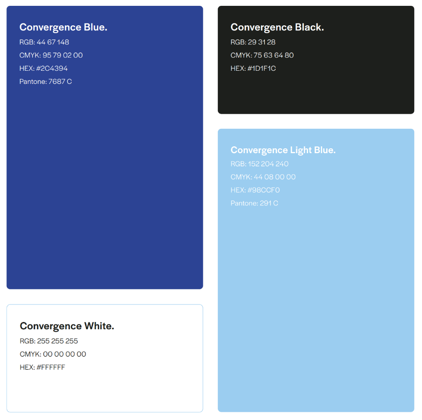
Primary colours
The colour palette defines the visual identity of the brand and ensures coherence across all communication materials.
Always use the specified colours to maintain a consistent and recognisable image.
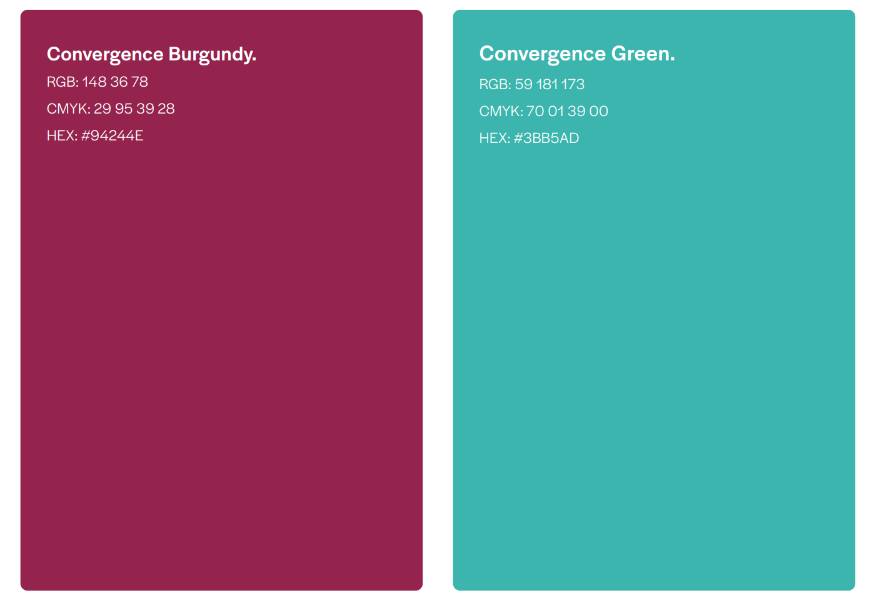
Secondary colours
The complementary colours enrich the visual identity by introducing two vibrant
accents that enhance clarity, hierarchy, and expressiveness across all brand applications.
The soft teal green brings a sense of openness, innovation, and environmental awareness, reinforcing the brand’s
forward-looking dimension.
The warm burgundy adds energy
and dynamism, supporting calls to action and highlighting key information with confidence and impact.
Together, these complementary shades create a balanced and engaging palette that elevates the overall identity while maintaining
harmony with the core blue tones.
Gradients of identity
The visual identity is built around three distinct gradient systems, each serving a specific purpose while maintaining overall brand coherence. |
|
|